


I was recently at a holiday mixer for the San Diego MCA-I group and ran across a Video Gear customer that bought an FS-700, but hasn't had time play with the paint controls on the camera. So Eric, this one's for you!
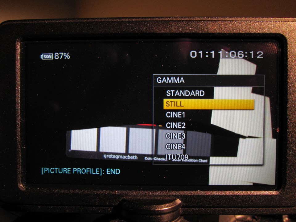
When you press the "Picture Profile" button on the camera a menu pops up with the paint controls for the camera. Anyone serious about using this camera should know this particular menu in detail for best results! Many of the titles are obscure or just not obvious. Hopefully I can help you shed some light on how to paint this camera properly.
Black Level
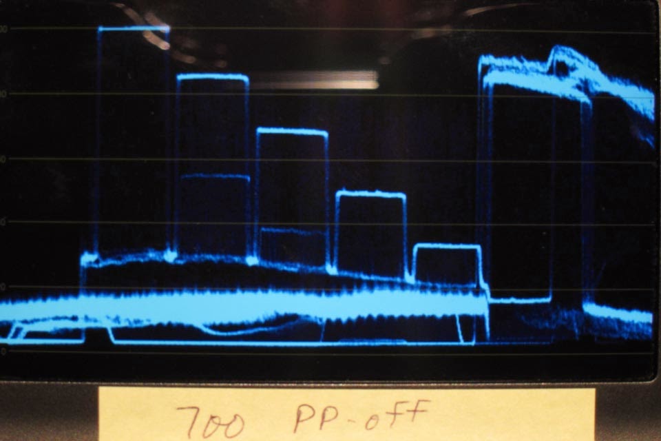
The "black level" is a somewhat obvious control. Oh sure...right after I claim some of the controls are "obscure" we start with a obvious one! You can see the extremes of the black level shifts below after I installed the lens cap. -15 drops the black level down and +15 brings it up. I still think it's strange that you can drop below 0 IRE on the Samurai Blade luma scope. I would have thought zero would be zero, but some of the picture profiles (standard, cine1, cine2) assume you want broadcast levels (black = 7.5 IRE). The Blade luma scope must be looking for black = 7.5 IRE(?)


Gamma
Gamma is the characteristic tone curve of the camera. Art Adams at Pro Video Coalition has done a more comprehensive study of the FS-700 gamma curves and I recommend that you read their article as well. For this article I used an uncalibrated Macbeth color checker to generate the six step tone curve examples. Art's use of the DSC chart in the PVC article is a much more accurate and usable representation of the gamma curves. I just didn't have a DSC chart available to do this test. I assumed the third neutral patch from the right was 50 IRE in all of these gamma curve measurements.
I will typically use Cine4 for most outdoor scenes because it holds highlights and Cine3 for most indoor scenes because it holds shadows. When in doubt on highlight retention I use Cine4. Some of the gamma curves also lift the black levels or cap the white level at 100 IRE, which seems silly for a "cine" gamma.


Black Gamma
The black gamma controls the fall of the tone curve into black. There are three ranges: high, middle, and low. You can only choose one to control. A negative level value drops the black level down and a positive level value raises the black level. Below is an example where I took the cine4 gamma and applied a value of -7 to the "high" range of black gamma. You can see how the two furthest right neutral patches on the Macbeth chart have dropped in IRE value. This would typically be referred to as crushing the shadows.


Knee
Analogous to the black gamma setting is the knee setting. This simply controls the gamma curve in the highlights. You can set the "point", which is the inflection point on the gamma curve within the highlights from 105% to 75%. Then the curve is either made more extreme or less extreme through the "slope" setting. Below I show an example where I set the inflection point to 82.5% and set the slope to +3 to lift the highlights just a little. Middle gray and the shadows are unaffected. In retrospect I should have set the value to a more extreme value to make the example more obvious.


Color Mode
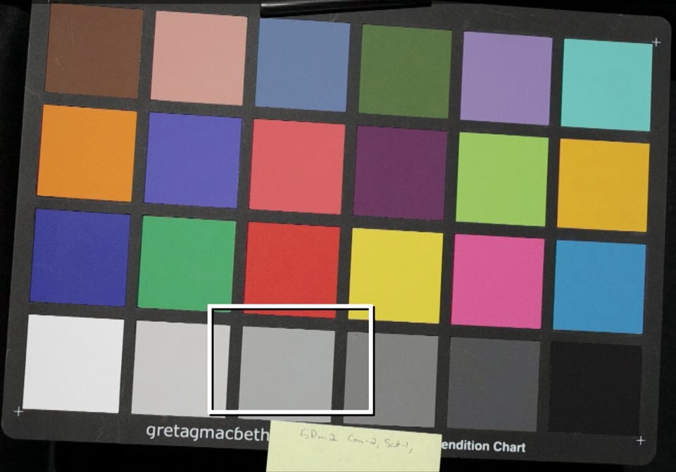
Color mode is just the color matrix of the camera. It assigns the hue and saturation of each color. To understand the difference here you really need to know how to read a vectorscope. Each hue is represented by an angle on the circular diagram. The saturation of the color is represented by the length of the vector from the center of the circle toward the circumference. You see blue at just less than 0 degrees and red at around 100 degrees. Lucky for us, the Samurai Blade draws the vectors with the colors they represent. B=blue, MG=magenta, R=red, YL=yellow, G=green, and CY=cyan. Normally with a DSC color chart the vector angles would line up with the target boxes for their respective colors. The Macbeth chart isn't color calibrated, so all I can show you are the differences.
The "Level" setting tells you how far away from "Standard" color mode the respective color mode gets. So when you have the color mode assigned as "Standard" it doesn't matter what value you assign to "Level". If you have the color mode assigned to "Still", for example, and have the "Level" set to 8 then the color assignment will fully look like the "Still" colors. If you have the "Level" set to 1 then the colors will be assigned mostly like the "Standard" color mode. You can go in between the two color modes to any degree you wish, sort of like an audio mixer, but for color assignment.
From the vectorscope plots you can see how the "Pro" and "Cinema" color modes are somewhat desaturated compared to the rest. "ITU709" has the most saturation. Also note the differences in hue angles, particularly the yellow, red, and blue color assignments. Most of the time I just use ITU709 because I know it provides nice results with mostly accurate colors. With enough camera test time I might use one of the other color modes.


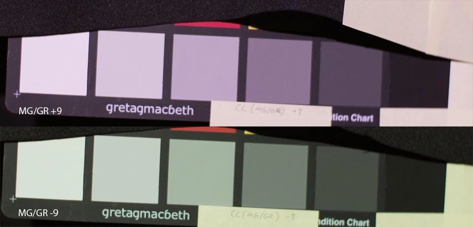
Color Level
Color Level is nothing more than saturation. -8 is gray fully de-saturated and +7 is very saturated. The comparison picture below shows the difference between the three levels of color.


Color Phase
The color phase control rotates the color assignments. A value of 0 indicates that there is no color rotation . In the pictures below you can see red/green/blue being rotated counter-clockwise when the color phase is set to -7. This means that red becomes orange, green becomes more cyan, and yellow becomes more green. Likewise when you set the color phase to +7 the colors are rotated clockwise and red becomes magenta, green becomes yellow-ish, and yellow becomes much more orange.
Generally speaking I leave this control completely alone. You can get some psychedelic colors when you mess with this color control and that's not good unless you're making a movie where you want everyone to look like they have jaundice (color phase=+7)! User beware.


Color Depth
I'm going to punt for now, because I'll be talking about this control later in the article. In short, this menu has individual controls for R/G/B/C/M/Y. A negative value makes the color lighter and the positive value makes the color darker. Generally this control does not change the hue, nor the saturation - only lightness. This is very useful for matching colors between different cameras, even when the color assignments don't completely match.
WB Shift
This controls the white balance shift. There are two types of white balance shift available. LB-CC and R-B.
The LB-CC mode has two controls. One for Color Temp, so you can shift the white balance toward amber (warmer) or blue (colder). The other control is for the Green-Magenta balance, which is infinitely useful for imperfect sources like fluorescent bulbs (green) and LEDs (who knows what!).
The R-B mode has two simple controls for red gain (R-gain) and blue gain (B-gain).
When you select the LB-CC mode you can only use the first two controls. When you have R-B mode selected you can only use the last two controls. So if you're in R-B mode and try to change the color temp nothing will happen.


Detail
And finally...the detail setting. "Detail" is nothing more than a fancy way of saying sharpness. The "Level" can be set from -7 (basically off) to +7 (over sharpened). The "Level" settings correspond to more detailed settings you can set manually, but Sony doesn't tell you what each "Level" actually means in terms of settings.
My recommendation is to always turn the in camera sharpening off. Sharpening is something you do in post to make up for a lens/codec issue. Over-sharpened footage is a tell-tale sign of poor footage capture and there's nothing you can do in post to remove over sharpening artifacts. My two cents. So I typically go into the "Manual Set" control and turn the settings to what you see below. That way I'm not allowing the camera to mess up my footage before I get it into the edit bay!
Showing the difference on the web wouldn't be a good representation. I recommend trying this control for yourself to see where you like it. Some people like to set the level to -4 (Abel Cine profiles come to mind).


Now for an Example
I had two cameras with me today. The FS-700 and 5D mark II (yes, I'm aware it's obsolete). My goal was to match the two cameras as closely as possible using a standard picture style on the Canon camera and a plethora of picture profile settings on the FS-700.
First, let's start with the gamma curve and color assignments on the Canon 5D mark II camera. Like most video shooters I use the neutral picture style and usually set the contrast=-2, saturation=-1, and sharpness=0. This fits most general purpose video shooting. It's not color accurate, but it does render skin tones nicely, saturates the colors correctly, and has a nice smooth roll off into highlights and shadows (at least by DSLR's standards).
Sorry about the mess of the luma scope. I didn't have a good way to isolate the neutral patches. You can see the patches at about 87, 78, 65, 50, 30, and 10 IRE from left to right. Also note how far off the green and cyan hue angles are on the vectorscope plot. This will be important later.


The default picture profile on the FS-700 is somewhat more contrast-y in the highlights than the 5D and the colors are assigned very different with the picture profile turned off. The colors also appear to be over saturated, which isn't good in general. Notice how the shadows are lifted as compared with the 5D mark II. The FS-700 tends to see pretty far into the shadows, often 2 stops more than the Canon DSLR camera.

So what I did to match the two cameras is use the following custom picture profile settings.
- Always start with the tone curve!
- Set the Gamma to Cine4
- Set the Black Gamma to High and -7 to crush the shadows a bit more and match the shadow tones on the 5D mark II
- Set the Knee to Manual at 82.5% and +3 to better match the highlights
- Then move to the color controls
- Set Color Mode to Pro with Level 8. Note that the green and cyan hue angles are just way, way off but everything else matches within reasonable tolerance - most notably red and yellow with bound skin color.
- Set Color Level +3 to add saturation because the Pro Color Mode is a bit desaturated
- Ensure Color Phase is 0
- Set Color Depth G=-3 (lighter) and B=+1 (darker). Even though green is off in hue, some of that can be visually hidden by matching of the lightness of the color. It's a compromise.
- Turn off all in camera sharpening we can
- Set the Detail to Manual and use the settings I mentioned before.

Leave comments if you have questions or call the shop and talk to Michael or Dominique.
Nice! Thanks for the write up!
ReplyDeleteGreat Job Stuart. I really like this post
ReplyDeletethis is awesome I will test it today!
ReplyDeleteExcellent work, thank you!!!
ReplyDeleteHi, Stuart. Would you post your Canon picture style?
ReplyDelete